The Plum Guide
Booking platform for the world’s best vacation rentals, holiday homes, short term lets and Airbnbs. Every property has been independently tested and reviewed by their hospitality critics. Like the Michelin Guide - but for homes.
Consultancy, UX Design, Design Audit, Responsive Website, Ecommerce
↓
Project background
Background:
Plum got in touch with me 3 months after their launch as they wanted to boost the conversion rate of their MVP.
They were happy with the visual design of the site already, but the site was not converting as they had hoped.
They wanted advice on how to optimise the user experience, making it crystal clear to users what they offer and why they should choose Plum over other sites like Airbnb.
My role:
Only designer on the team.
Worked closely with the CEO and CTO to understand the sites current performance/analytics and to understand the companies goals.
Provided consultancy recommending proven design tricks and best practices to boost conversion.
Executed these ideas for key pages including: homepage, search, search results, product page, contact and booking/checkout.
Optimised designs for both desktop and mobile.
Liaised with the developers for handover.
Results:
Improved conversion rate
Increase in bookings with a decrease in online enquiries to customer service
Increase in users making it past the search page
Increased user retention rate
Decreased design to dev handoff time
Problem #1
User feedback showed that users initially thought the site was a magazine and not an ecommerce site. Analytics showed users were looking but not purchasing.
Solution 1:
Amends to homepage
❌ Existing design ↓

Exiting design:
No call to action in title
No idea of price
No colour hierarchy
No credibility or trust
✅ New design ↓
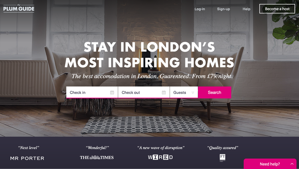
New design:
Made homepage tag line more of an action Eg. “Stay in London’s most beautiful homes”
Added a starting price to the tag line so users understand this is an ecommerce site.
Introduced a CTA colour that stands out more - UX best practices show this will receive more clicks.
Highlighted testimonials the company had received from top UK press, to create trust in purchasing.
Added a support chat so users could quickly contact customer service if they had any problems or questions.
Changed CTA from ‘Apply to Plum‘ which is vague to “Become a host.“ This CTA is now clearer in who should be applying and for what. Also by using terminology also used by Airbnb helps users understand what kind of site this is and how it works.
Solution 2:
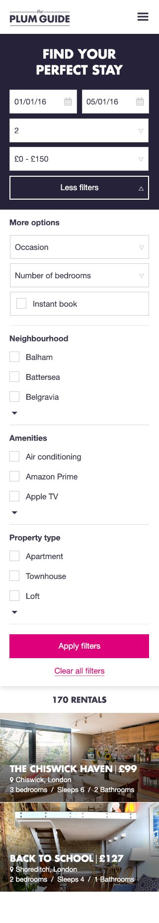
Amends to search page

❌ Existing design ↓
Existing design:
No instruction or introduction to page
Filters look messy and confusing, (there is no clear hierarchy)
‘Map view’ button takes up too much attentionU
nclear this is a booking platform
Text is hard to read over the image - too small
✅ New design ↓

New design:
Added a call to action title at the top key pages. E.g. ”Find your perfect stay.” This way even if the user does not land via the homepage they still have an idea of what the site offers.
Made the filter much more visible and easier to use. Before it blended into the background.
Made pricing much more visible so users know this is a purchase and not a property showcase in a magazine.
Solution 3:
Amends to listing page
❌ Existing design ↓

Existing design:
Confusing hierarchy
How does the user move between photos?
Price obstructs the image
Fields are small and unclear
CTA is lost
Full width text is hard to read - makes the eye move too much
No sharing links
Plum promise is lost
✅ New design ↓

New design:
Created an image carousel for users to easily flick through
Clear hierarchy - name of the property, key info and then the booking info in its own space.
Text does not overlay the image, making it easier to read
Bringing the ‘Plum Promise‘ above the fold and highlighting it in a new colour
Option to view more photos and to contact seller brought up higher - key CTA’s
Book now - new CTA primary colour
Problem #2
How do we create trust. As a startup competing with giants such as Airbnb and One Fine Stay we had to quickly and clearly show what The Plum Guide offered and why they were worth trusting.
Solution 1:
The Plum Promise
Creating “The Plum Promise” stamp was just one of the ways I helped to create trust. This stamp was placed on all key booking pages to reassure the user all the reason why Plum is worth using.


Solution 2:
Highlighting press
Showcase quotes from esteemed UK press on the homepage and creating a press page.
Solution 3:
Create an excellent booking experience
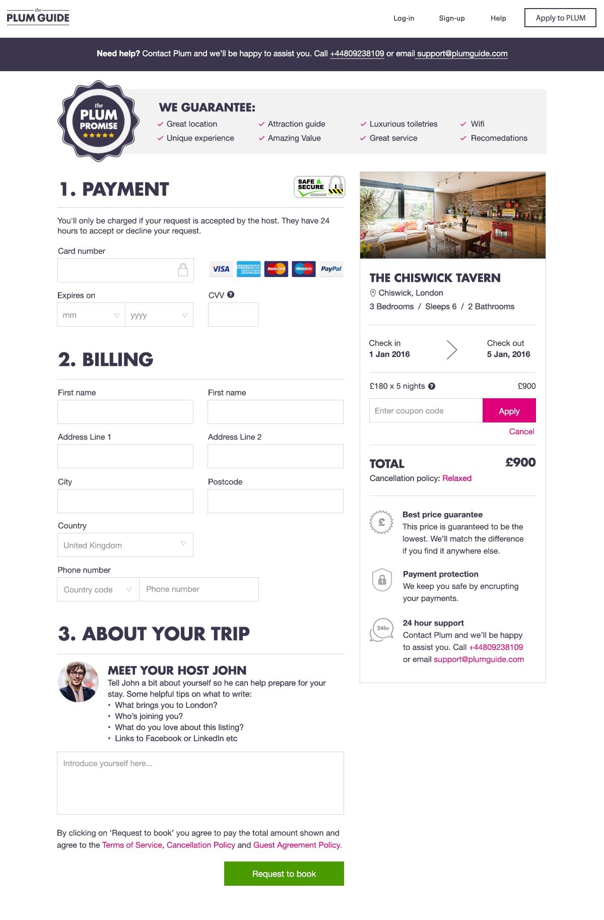
Card protection logo to create reassurance that user card details are safe with us
Highlighting Plums USPs
Creating clear hierarchy between payment and billing details.
Introducing you to your host and providing the opportunity to leave a note - creating a personal touch and creating a feeling of safety. (Dealing with humans not a faceless website)
‘Request to book’ CTA in a new colour to create hierarchy.
I focused on creating a clear and effortless booking experience for users so users felt safe entering their card details and making it to the end of the purchasing funnel.
Providing all information relating to the property, dates and price on the right so it is easy to review.
Contact number and email offering support, so not to loose the user at this crucial stage of booking.
Highlighting the Plum Promise.
Customer service are at the heart of The Plum Guide. How do we show this to our users?
Problem #3
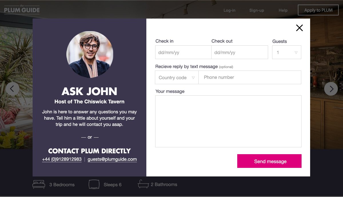
Solution 1:
Make it easy to reach customer service

Add an instant chat to all pages
Add customer service’s phone number to all booking pages
Highlight the property owners and hospitality critics more so they can share their passion for the property. Adding a friendly and human touch that is missing from competitors such as Booking.com
Optimised
for mobile
As a standard practice


UI consistency and design handover
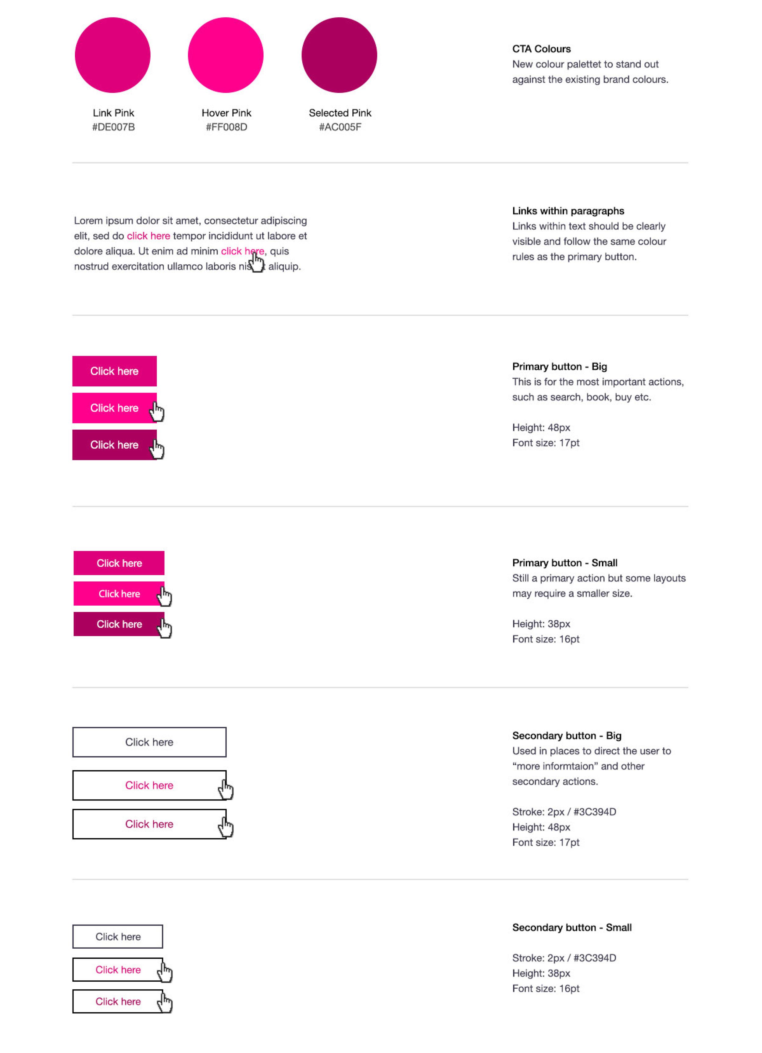
To maintain consistency and ensure efficient design to dev handover, I developed a modular design system based on reusable components and their states.
The style library included updates to fonts, call to actions, cards, list items, controls and image guidelines. Every component can be rearranged and combined with others while maintaining design consistency and recognisable UI patterns for the user.