Freddie’s Flowers
A flower subscription startup delivering fresh flowers to users across the UK. All flowers are seasonal, sustainably sourced and designed by Freddie Garland.
↓
Tags: UX Design, UI Design, User interviews, Prototypes, Responsive Design
Freddie’s Flowers got in touch with me a few months before Christmas. They were looking to increase their conversion rate. They had a healthy flow of traffic arriving on their site but their bounce rate was very high. Plus, the users who were making it to the signup flow were dropping off in large numbers before converting. The project involved working as a Senior Product Designer on the Freddie’s Flowers responsive website, with a mobile first approach as 82% of users were on mobile.
⭐ North Star Metric: increase conversion rate from 1.7% to 3.4% ⭐
Project background
Step 1: Plan
Working closely with my project manager, together we planned:
1. The best design and user testing approach.
2. When to check-in with engineers and key stakeholders.
3. When to have the final designs ready for build.
Step 2: Audit of live site
Identifying initial UX issues and any quick wins
Step 3: Decide on initial areas of focus
Issue 1
Find out why existing design is not converting well.
Solution
Include live design in the user testing prototype and gather user feedback.
Issue 2
The business will now be offering three flower subscription sizes. Small, medium and large arrangements. How do we show this to our customers?
Solution
Create a product selection module, showcasing the three options. The copy team wanted to give the options more creative names other than small, medium and large. Users could swipe through these options, select their preference or click more info for product details.
Issue 3
How do we explain the difference between the three options and show more of our USP’s.
Solution
Create a product page for each arrangement so users can understand the difference and find out more about what makes us different from our competitors.
Step 4: Prototype
Prototype made in Figma showcasing the existing flow with the addition of the new subscription options and product page.
Step 5: User testing
We tested the prototype on 8 potential new users, who were specifically interested in a flower subscription service.
We wanted to understand what their first impression of Freddie’s was? What they thought the offering was? And to see how they moved through the flow and if their expectations were met.
Our key goal was to understand - why are users bouncing!
I created a script and interview template in Notion.
Introducing myself and explaining how the session would work. Followed by ice breaker questions to learn about the user and to make them feel open and comfortable. Then moving into open questions about the product, their experience and expectation. And finally summarising the session and sharing any final thoughts.
Step 6: Documenting the results
After each interview I went through the written notes and documented the user feedback in Miro.
I used a colour coded post-it system to clearly breakdown the feedback and share with the rest of the team.
Grey - user information.
Green - things the user liked about the experience.
Red - things the user didn’t like about the experience, trouble they ran into or areas they misunderstood.
I also organised the feedback by user, where in the user journey and also grouped topics that were repeated.
Step 7: Summarising results
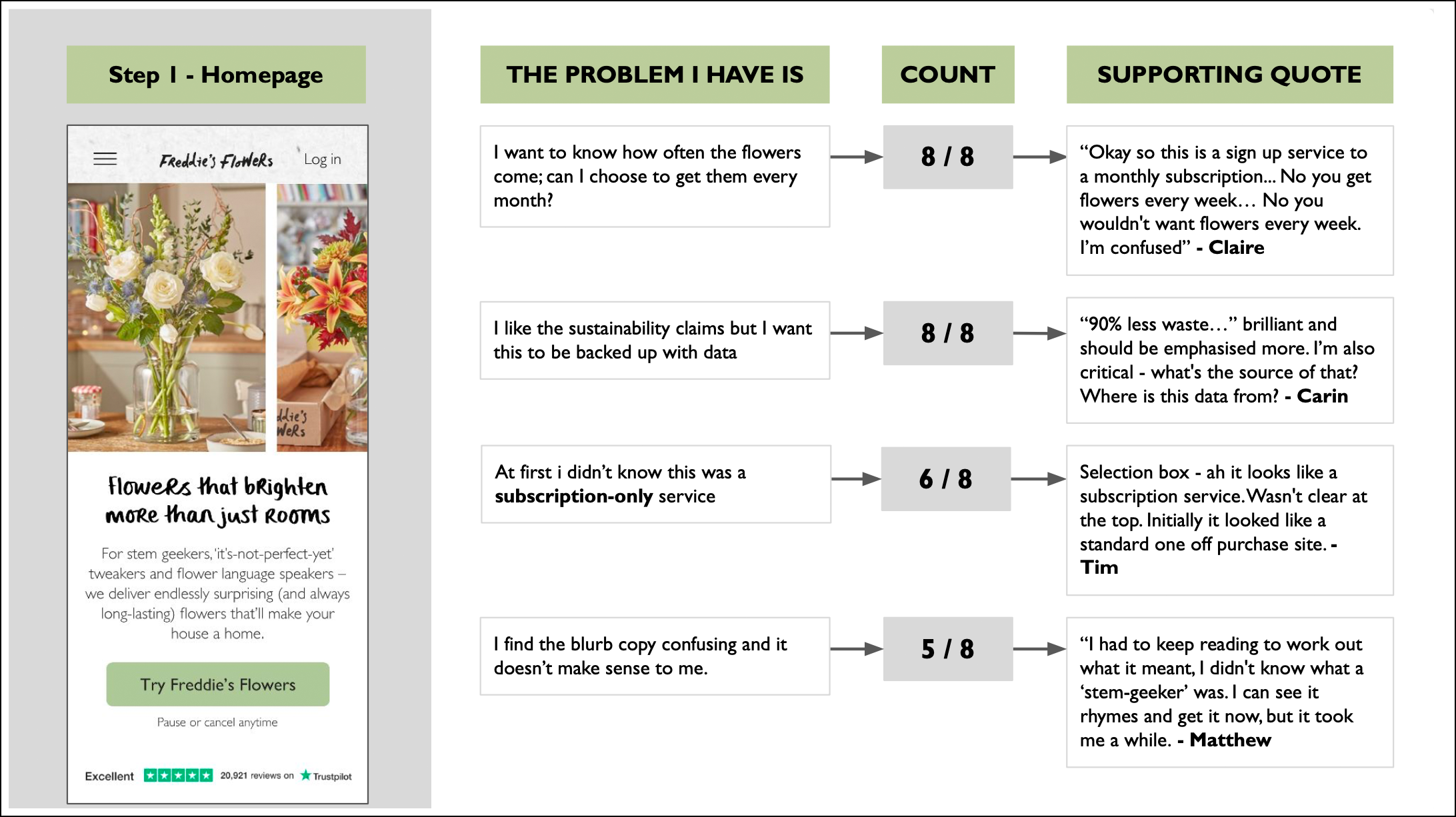
I created a presentation deck outlining key findings with supporting quotes and hierarchy in term of issues that were raised the most. I then shared this with the rest of the team.
Example slides below.
Key findings to focus on in order to improve bounce rate:
All users wanted their subscription to be monthly instead of weekly or bi-weekly.
Users were unsure this was a subscription service.
Users wanted more clarity on what flowers they would actually be receiving.
All users mentioned how important sustainability was to them and the influence this had on them choosing Freddie’s over competitors. They want more info and for data to be backed up.
Step 8: Design amends based on user feedback
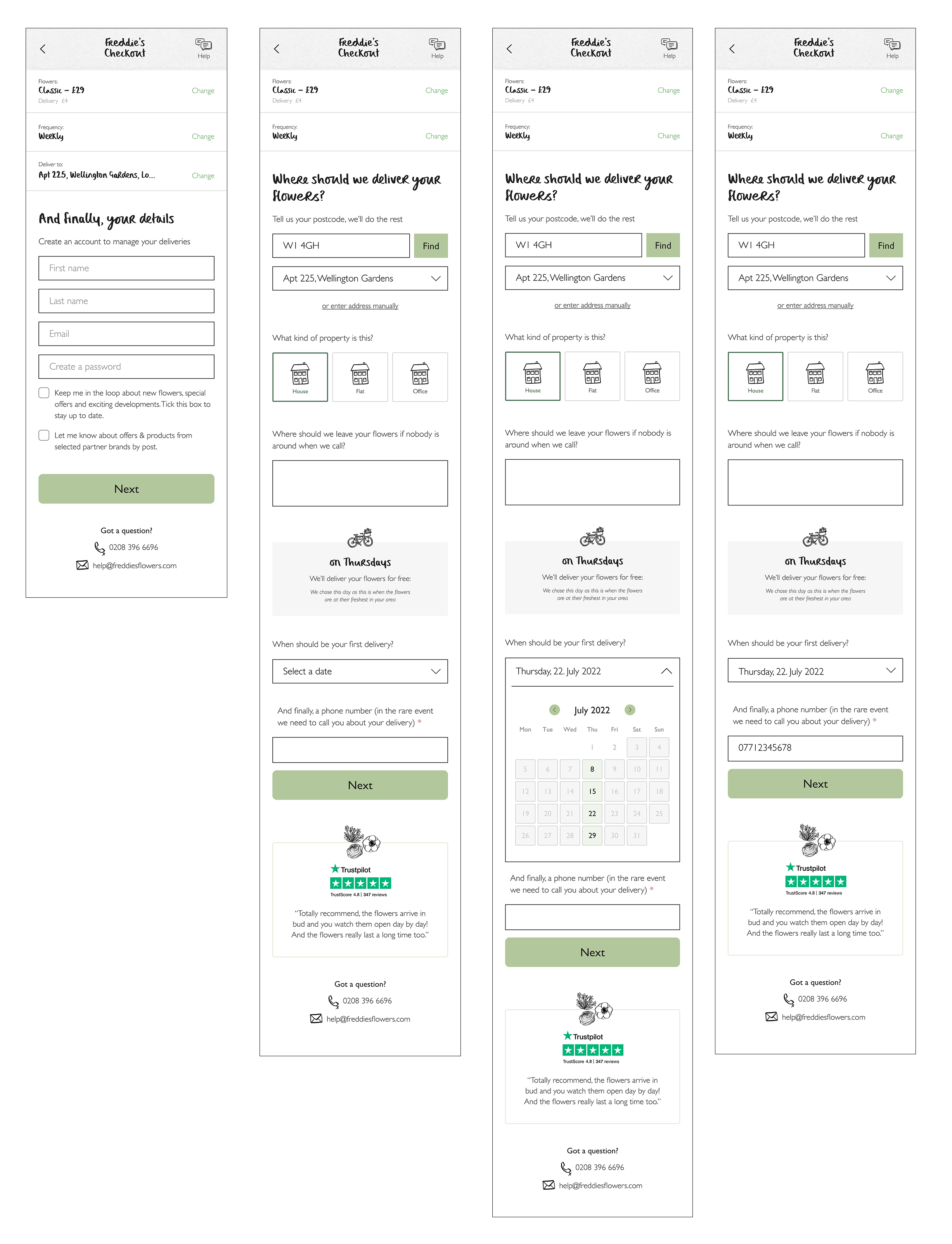
Now we had clear user feedback it was time to go and rework the designs based on this new data. There was also an update on the branding which was also included in these designs. Below are examples of the changes made…
New screens about sustainability


